Takoyaki Entertainment Branding
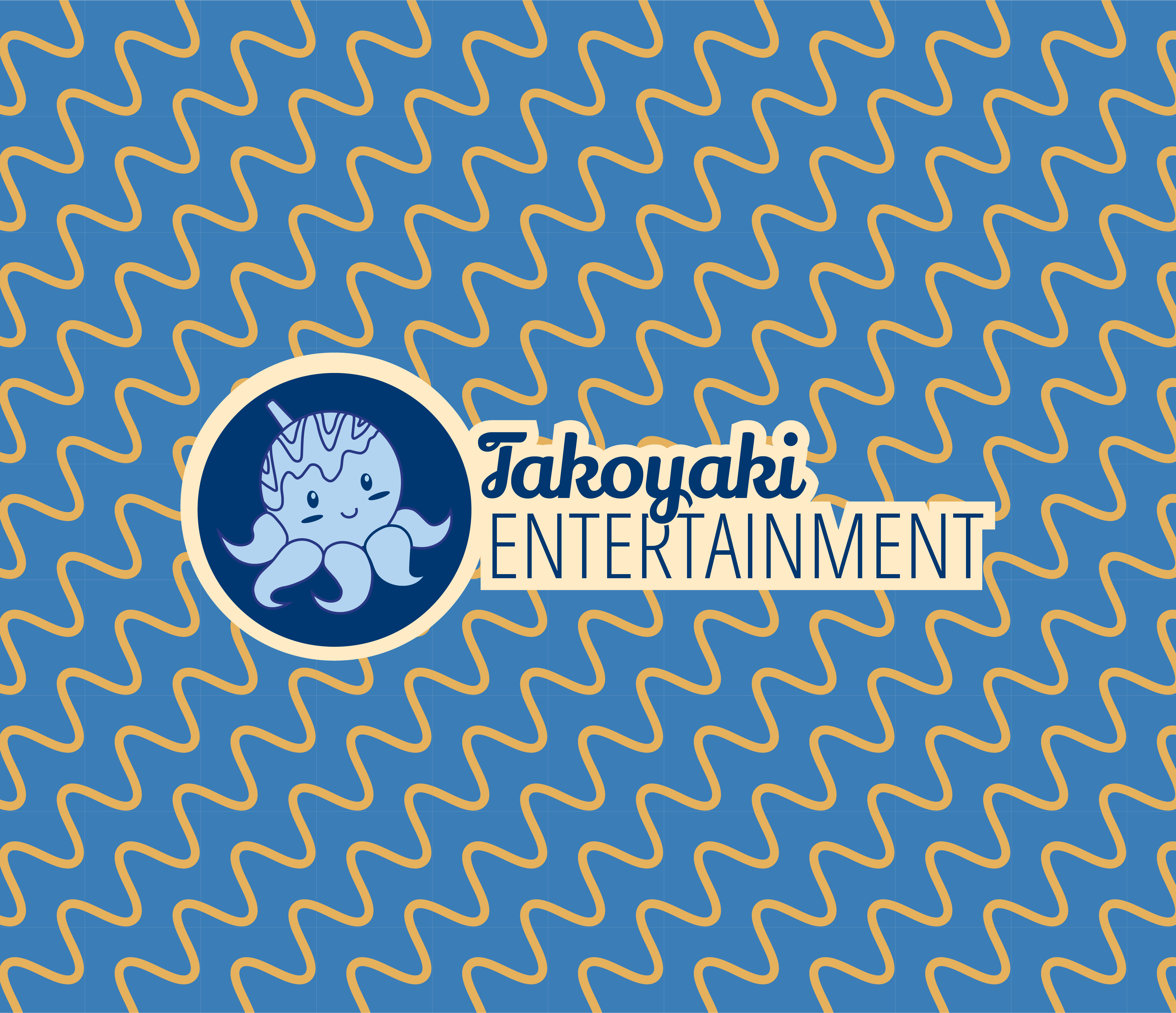
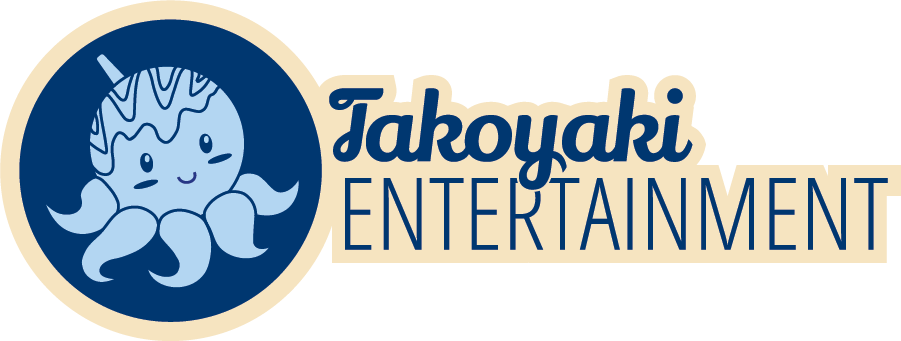
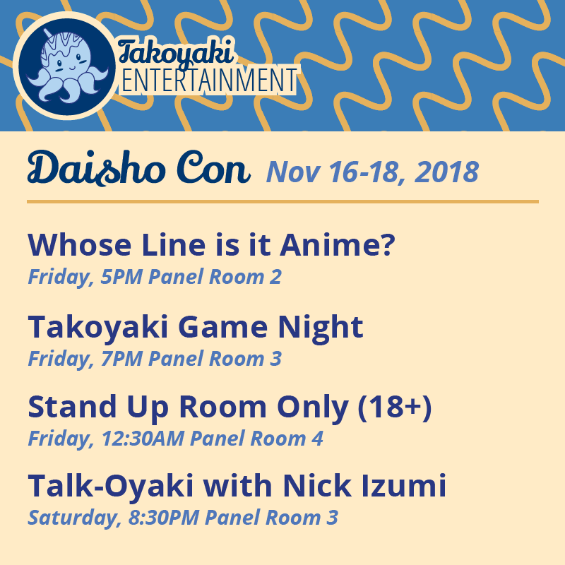
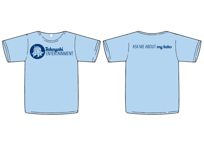
The comedy group I manage and perform with needed a logo when we formed in 2016. We decided on the name because takoyaki is one of our favorite Japanese foods and we wanted to make it clear we are a performance group. Tako means octopus so I knew that needed to be a part of the icon. I also wanted to play with what takoyaki actually looks like so I mimicked the squiggle of sauce/mayo on the background pattern. For some fun contrast I used the color palette from the blue ring octopus. I chose the fonts to be a contrast of fun and fluid against strong and geometric.
Let’s work together!
Email me at hello@princessphoenixstudio.com or call me at 608-676-7375
